- Solutions
-
Products
-
Resources
Sales Automation Tools | Cirrus Insight by Kristi Campbell View all Blog Posts >Get the App, Get the Sidebar, & Get Your Trial Going HereUnleash limitless growth opportunities by partnering with Cirrus Insight.
- Pricing
Cirrus Insight Dashboards Get A New Left Navigation
We are excited to show you a major update to our admin and user dashboards that will be rolling out in Q1 2025!
Table of contents:
We have spent the last several months improving how our customers get around the dashboard and we are providing a quick outline of what to expect. But first here are a handful of key points to know:
- No links are changing:
- No body likes to have to re-learn where things are, they especially don't like it when their old links stop working. To make it as easy as possible to adopt the new navigation, we kept all the URLs the same. This allows you to jump straight to the pages you want from bookmarks or browser autofill.
- Content on the page is staying the same:
- All the pages you've come to know are staying exactly the same as far as the content on them. We have not moved any settings, graphs or reports within the pages. What you will notice is the navigational placement of these pages will be different. For example we are pushing our scheduling automation tools to the forefront, which is why Scheduling is one of the first icons in the new navigation. On some pages we found that adding a tabbed interface to switch between sub pages makes for a much better user experience.
- For Admins: No more switching between user and admin roles:
- That's right! You don't have to flip/flop between a user dashboard and admin dashboard to get to what you need. The left navigation has a dedicated icon called My Organization that sits below the user dashboard icons. Clicking My Organization will show the admin dashboard pages in the secondary navigation, making it easy to quickly get to what you need. Nothing has changed with regards to what you can access and change as an admin.
- For Admins and Partner admins: When impersonating a user or org, the left nav will change colors to indicate that you are in impersonation mode:
- During impersonation, the left navigation will turn a dark grey to signal that you are impersonating. To end impersonation, click the profile icon at the bottom left of the screen and click Logout.
- Mousing over primary navigation items will show the page name:
- To save valuable page real estate and make a more visually pleasing experience we opted to replace text with icons that display tooltips when moused over. The new icons provide visual queues and context into what they are for, making it easy for users to find what they are looking for.
- No more having to close a settings page to get back to the navigation:
- A constant issue we all faced was the fact many of the settings pages would cover up the left navigation, making it impossible for customers to get where they need to go until they closed the settings page. Now, no matter what page you're on, you'll always have access to the new left navigation.
- The User Profile icon, Org ID, logout, Cirrus Signature and Manage Connections moved to the bottom left of the screen:
- To make the most efficient use of space and remain consistent with modern web app design, we moved these elements inside the new left nav bar. We also added a navigation element in the profile pop out that allows users to quickly jump to the manage connections interface, a nice little addition to make life a little easier.
- Support and Knowledge Base icons now persistently visible in the new navigation:
- To make it even easier for our customers to get the help they need, we've added these icons to the new navigation UI, you will find these above the profile icon.
- New dashboard apps have dedicated icons:
- To drive awareness and ease of access to our dashboard apps, we are now showing each app in the primary navigation pane, making these apps one click away.
That was quite a bit more than a handful, but we feel it's important to set expectations and hopefully answer some questions up front. With that out of the way, let's dive into some visuals of what to expect.
New Navigation Elements:
The new left nav has 3 key elements:
- Primary Navigation
- Secondary Navigation
- Tab Navigation, also sometimes called tertiary navigation

New Navigation Behavior:
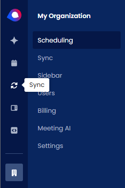
Mousing over primary navigation elements will show the item's name. The primary navigation element will be highlighted if any page within is selected. In this example you can see My Organization is highlighted because I've selected the Scheduling secondary navigation element Above the secondary navigation element is the name of the primary navigation item I selected.
I've also moused over the Sync icon. This helps provide consistent context into where a user currently is:
For Admins and Partner Admins:
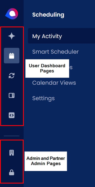
The primary navigation is split up with user pages at the top and admin pages below, separated by a horizontal bar. Users will always see their icons, but cannot see admin icons:
Accessing Child Orgs:
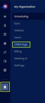
If you're a partner admin and you're looking for child orgs, click on the My Organizations icon and click Child Orgs:
Video Overview:


